
Show summary Hide summary
- iOS 26 home screen personalization: where the magic starts
- Mastering app icons in iOS 26: size, labels and clarity
- Icon appearance styles: Default, Dark, Clear and Tinted themes
- Strategic layout: arranging apps, widgets and themes that work
- Working within iOS 26 limits while pushing personalization further
Your iPhone can now feel like a custom-built device rather than a fixed grid of icons. With iOS 26, you gain a surprising level of control over color, layout and mood, often in just a few taps.
iOS 26 home screen personalization: where the magic starts
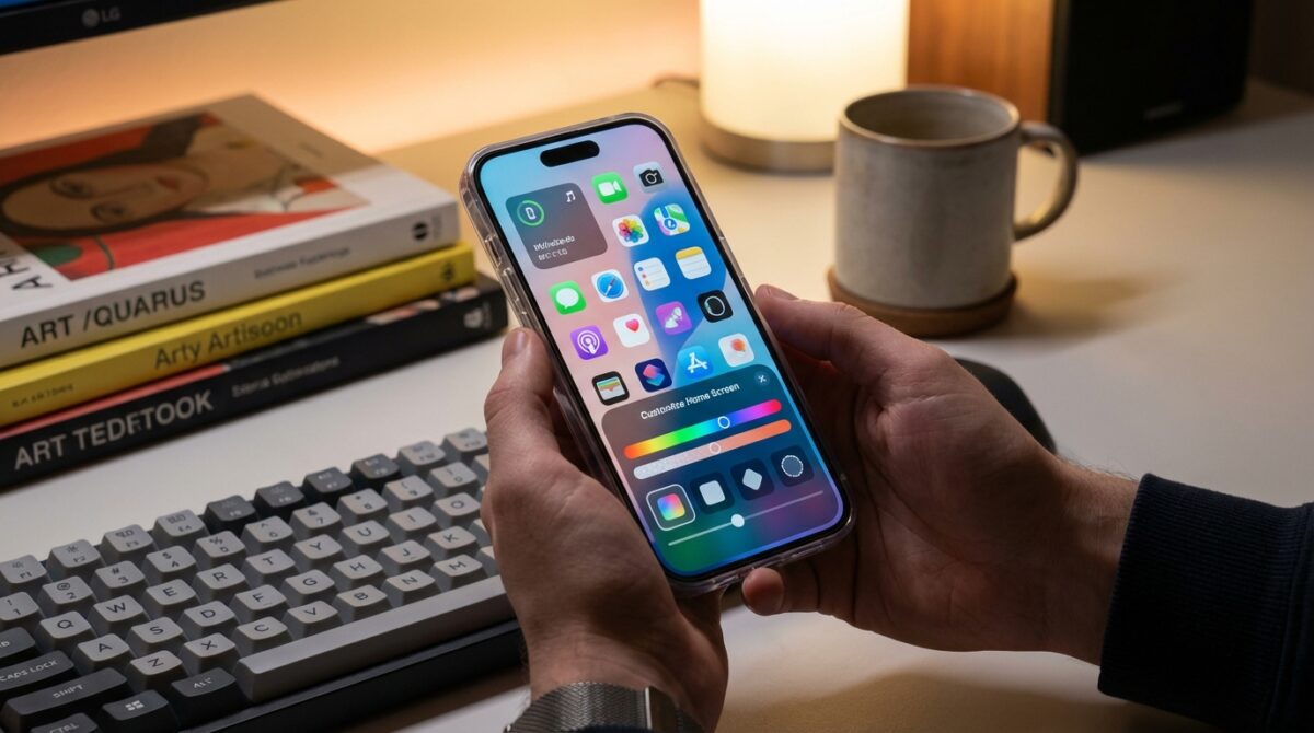
The heart of home screen customization in iOS 26 is the new Customize panel. Once you touch and hold an empty part of the home screen until the app icons animate, a simple tap on Edit in the top-left corner reveals the Customize option. This single menu controls icon size, appearance and tinting for every page, so your entire user interface shifts together.
Many users, like Maya, a product designer who relies on visual clarity, start by exploring this panel before rearranging any apps. The bottom sheet that appears lets you toggle between different icon styles, switch to larger icons and fine-tune a global color accent. This centralization means you no longer need to adjust each page individually, reducing friction and encouraging experimentation. Within a minute, your iPhone can move from stock layout to a look that matches your work, mood or even a specific project.
Transform Your Phone into a Classic Game Boy with the Pocket Taco
Nintendo Unveils Virtual Boy Accessory Enabling VR Adventures with Mario and Zelda on Switch 2
Mastering app icons in iOS 26: size, labels and clarity
One of the most visible upgrades in iOS 26 is the ability to resize app icons from the same Customize menu. When you tap the control that shows two different icon sizes, the system switches to Large App Icons mode. Labels disappear, the icons expand to occupy more of the grid and the gaps between rows grow. For people who keep only a few apps on the main page, this creates a gallery-like layout that feels almost like a themed dashboard instead of a dense grid.
Maya uses this mode when she is traveling with her iPhone Pro Max. Larger icons make it easier to tap her navigation, translation and camera apps with one hand. The tradeoff is capacity: fewer icons fit on each screen, so this approach works best if you lean on the App Library or Spotlight search. When she returns to the office, she simply repeats the same steps to return to the standard size, regaining more visible apps without losing the underlying organization. This reversible change encourages you to adapt the home screen to context rather than accept a single permanent layout.
Icon appearance styles: Default, Dark, Clear and Tinted themes
Where iOS 18 introduced a taste of visual control, iOS 26 turns icon appearance into a full palette of themes. The top row of the Customize panel offers four modes: Default, Dark, Clear and Tinted. Default preserves the original app icons created by developers, which many people prefer for easy recognition. Dark mode energizes the interface for low-light use, applying deeper backgrounds to Apple apps and some third-party icons, while optionally dimming the wallpaper for OLED power efficiency and reduced eye strain.
Clear and Tinted introduce Apple’s Liquid Glass design language, giving your home screen a layered, translucent character. Clear strips color from the app icons but keeps the text, letting the wallpaper shine through with a frosted overlay that changes subtly as you scroll. Tinted goes further by applying a single hue to supported icons and widgets. Once you select Tinted, sliders appear to adjust color and saturation, and an eyedropper tool lets you sample a tone directly from your wallpaper. Many users pair a muted pastel tint with Dark appearance to build a calm, distraction-light workspace that still feels cohesive and premium.
Strategic layout: arranging apps, widgets and themes that work
Even though iOS 26 keeps the traditional grid, organizing your apps now has more impact because spacing and icon appearance can change so dramatically. When you enter edit mode and drag icons around, you still cannot drop them anywhere on the screen, yet deliberate placement around a favorite wallpaper becomes far more visible. Some people cluster everyday apps at the bottom edge for easier thumb reach, then leave the top half open so a portrait photo or abstract image remains unobstructed.
Widgets sit at the center of many modern setups, especially when combined with a consistent theme. A compact weather widget beside a calendar tile can replace multiple single-purpose apps on the front page. Guides such as this detailed WidgetClub article showcase layouts that mix transparent-style widgets with tinted icons, aligning colors to Liquid Glass effects. For Maya, a medium-size Reminders widget occupies the left side of the first screen, while communication apps sit to the right, all unified by a soft blue tint sampled from her wallpaper using the eyedropper.
- Create a focus-first page with calendar, reminders and a notes widget.
- Dedicate a second page to media with music, podcasts and camera tools.
- Reserve a minimalist page with only a few core app icons and a single widget.
- Build a monochrome theme using Tinted mode and a grayscale wallpaper.
- Design a seasonal layout by changing wallpaper and tint every few months.
Working within iOS 26 limits while pushing personalization further
Despite its expanded toolkit, iOS 26 still follows Apple’s structured philosophy. There is no native support for per-app colors, third-party icon packs without the Shortcuts workaround or completely free icon placement. Icon appearance settings remain global: if you pick Tinted, every supported app icon follows that scheme across all home screen pages. For users migrating from more open platforms, these boundaries can feel restrictive at first, yet they also keep performance and visual consistency stable across the system.
Many creators embrace these constraints by focusing on themes rather than individual icons. Resources such as step-by-step Engadget guides and community tutorials like nikkilo’s iPhone customization walkthrough demonstrate how to combine system-level options with curated wallpapers and widgets. A typical setup might use Large App Icons, Dark appearance, a desaturated Tinted overlay and a single stacked widget, producing a minimal control center that still feels personal. This mindset turns limitations into a design brief, encouraging cleaner, more intentional home screen personalization instead of endless micro-tweaks.
How do I open the iOS 26 home screen Customize panel?
Touch and hold an empty area of your iPhone home screen until the app icons start jiggling, tap Edit in the upper-left corner, then choose Customize. The panel that appears at the bottom controls icon size, appearance modes and global tints for all pages.
Can I change the color of just one app icon in iOS 26?
iOS 26 does not provide a native option for changing the color of individual app icons. The Tinted and Clear modes apply globally to all supported icons. Per-app styling is only possible using Shortcuts-based custom icons, which behave like separate launchers.
Will widgets follow my Tinted or Dark home screen theme?
Most Apple widgets and many third-party widgets respond to Dark and Tinted themes, adjusting their background and accent colors to match. Some older widgets keep their original design, so visual consistency depends on how quickly each developer adopts the newer iOS features.
Does Large App Icons mode affect performance or battery life?
Could the Google Pixel 10 Pro Boast the Ultimate Gaming Display?
The Amazingly Kodak Charmera: Stealing Hearts Despite Its Quirky Snapshots
Large App Icons mode mainly changes layout and label visibility; it does not significantly impact performance or battery life on modern iPhone models. Battery usage is more influenced by your wallpaper brightness, widget activity and background app behavior than by icon size alone.
Are there recommended resources for iOS 26 home screen inspiration?
Yes. You can explore curated examples and layouts on sites such as Engadget, WidgetClub and several design-focused blogs. Many creators share complete themes, including wallpapers and widget suggestions, which you can adapt to your own workflow and visual preferences.